The Caribbean Hut Restaurant Rebrand Project
For this project, I wanted to rebrand a restaurant that is part of my Caribbean culture called
Caribbean Hut. Caribbean Hut serves wonderful authentic dishes from all the different islands in
the Caribbean such as, Trinidad and Tobago, Jamaica, Guyana, and many more! They're dishes
consist of, jerk chicken, curry chicken, roti, and patties, which are all the foods we will enjoy
when we step our foot into the Islands, giving us that Caribbean experience. When I first saw
the brand identity of Caribbean Hut, I thought to myself that this restaurant needs a huge
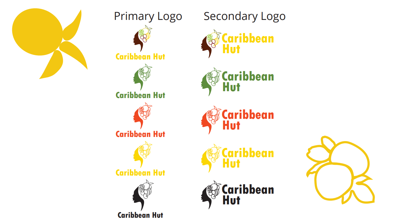
rebrand that will bring the feel and aesthetic of the Caribbean. So to achiecve this goal, I used
colors that present that authentic feeling of the Caribbean and not the usual fun, playful, and
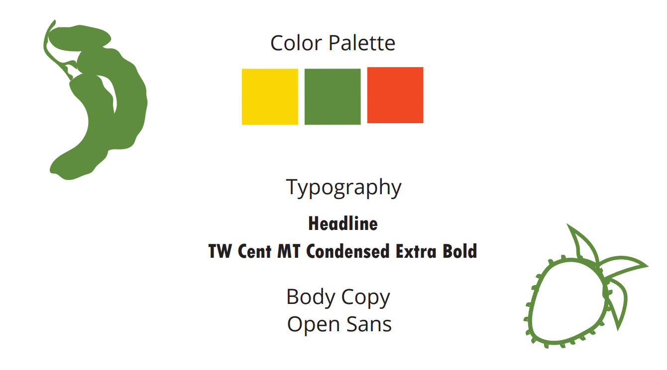
tropical vibe that we usually see. The colors I used were a warm green and orange, and a bright
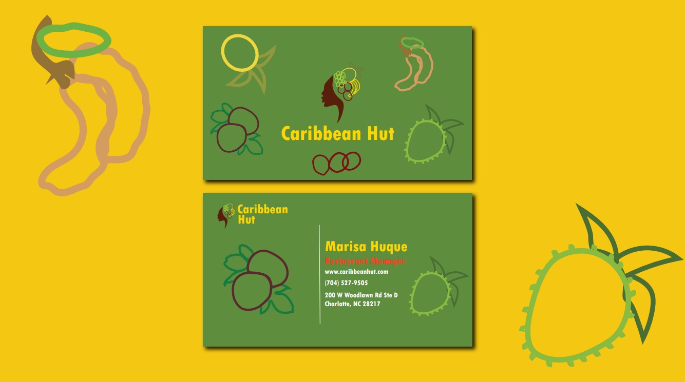
yellow, which are some of the signature colors of the Caribbean. I incorporated line art graphics
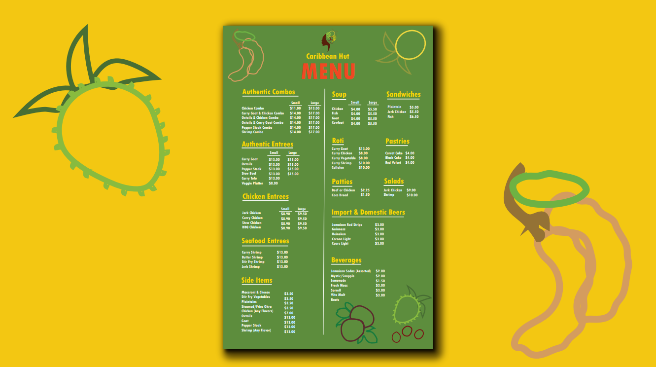
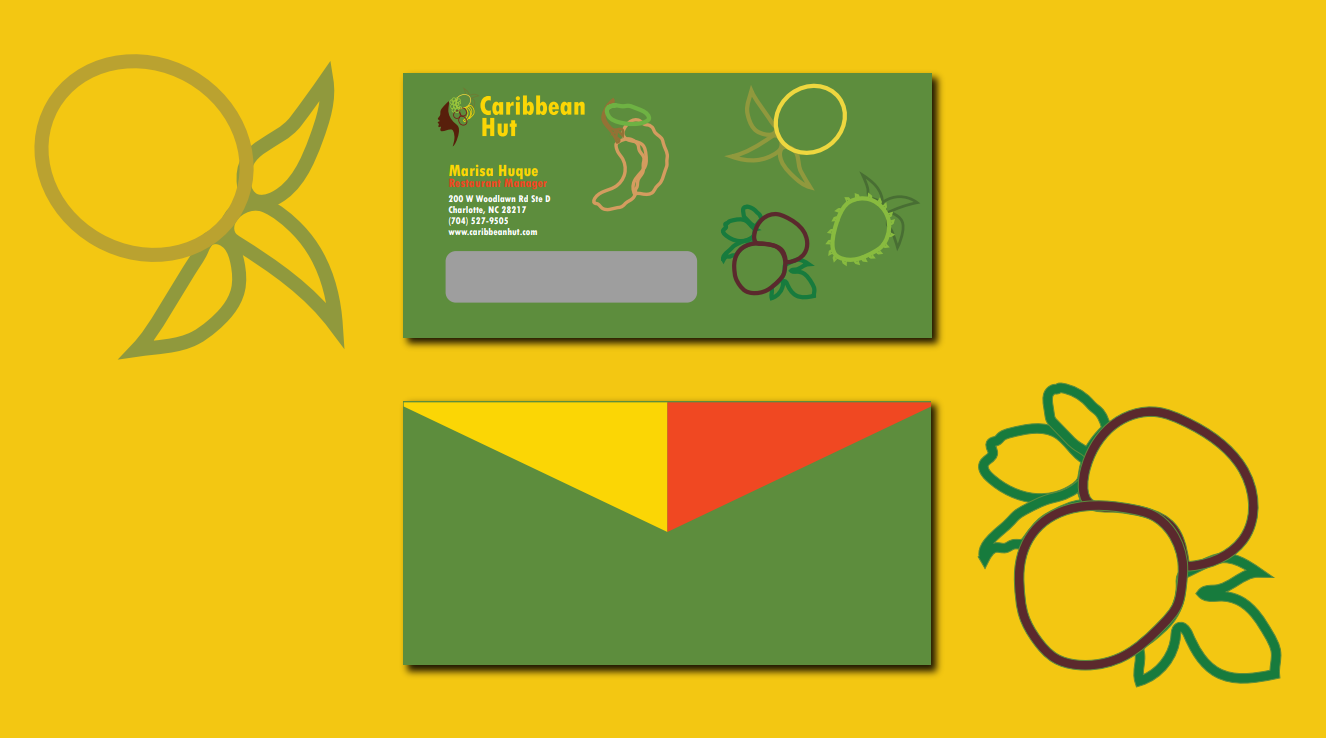
of the delicious fruits from the Caribbean, such as mango, tambarind, soursop, plums, banana,
and grapes into my designs to evoke a tropical but authentic feeling. For the typography, I
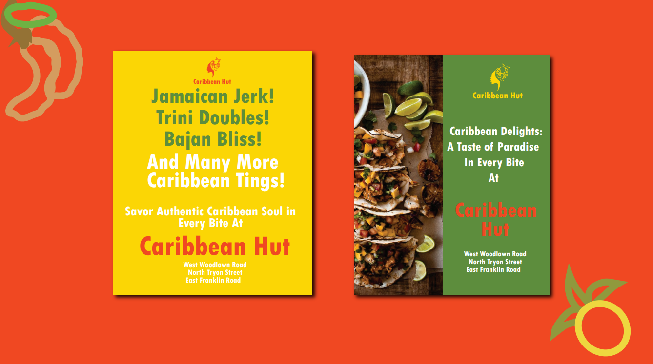
chosed the typeface, TW Cent MT Condensed Extra Bold to help bring that Caribbean Vibe,
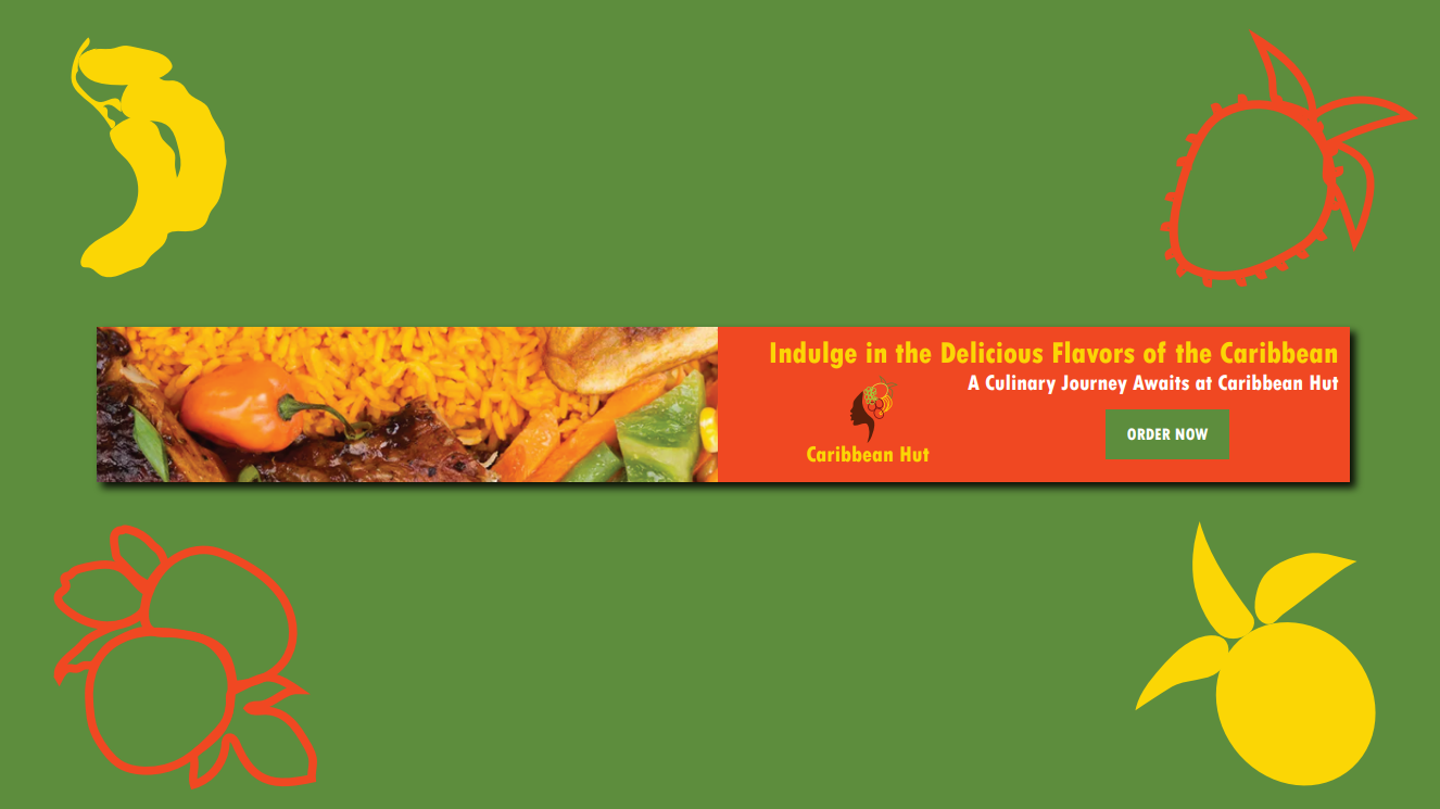
especially for ads like the digital ad and the print ad and I had also used the typeface, Open
Sans for the body text of the letterhead to match with the aesthetic of the main typeface.
Overall, I really enjoyed creating a new brand identity for a restaurant that is of my
culture and heritage
The Brand Board
The Letterhead
The Envelope
The Business Cards
The Advertisements
The Web Banner
Back